← Browse Dives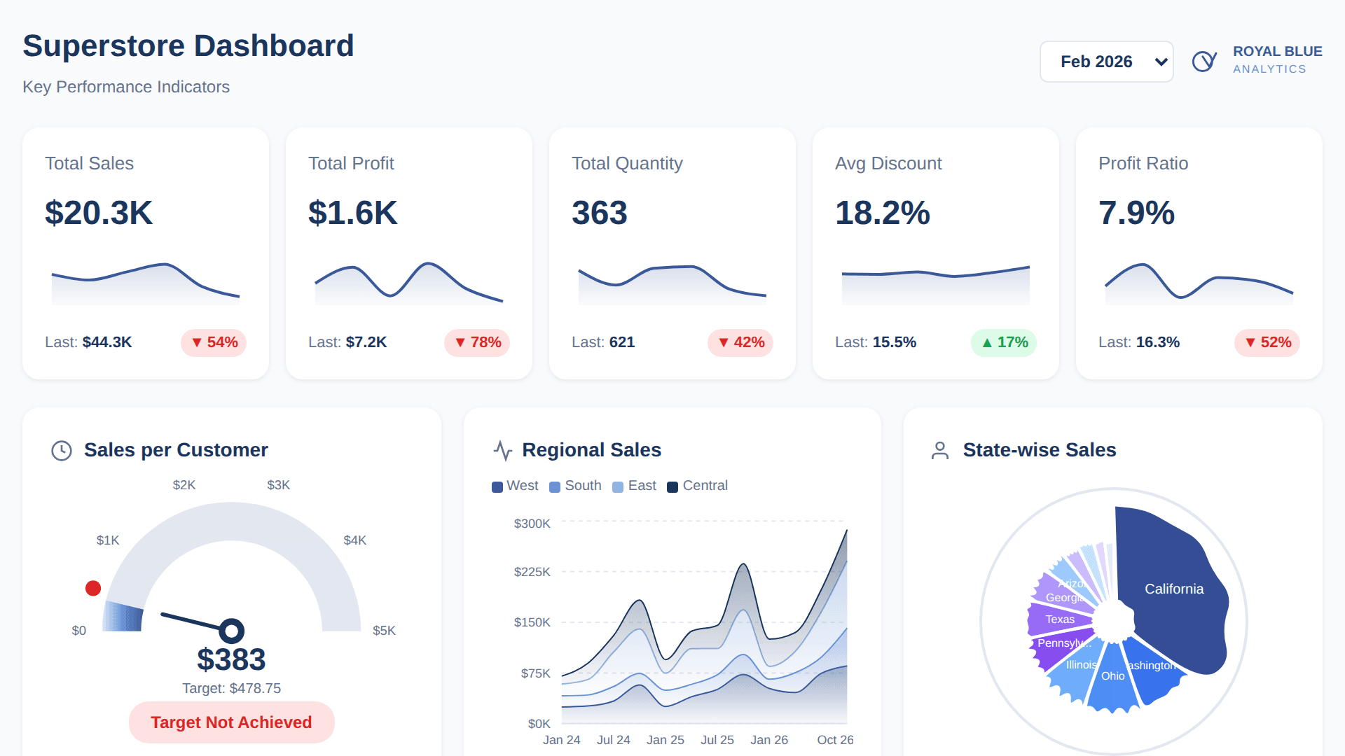
Loading Interactive Dive...
KPI Dashboard using Tableau Superstore Data
Royal Blue Analytics branded Superstore KPI dashboard with 5 KPI cards, sales per customer gauge, regional sales area chart, state-wise Voronoi treemap, order distribution bars and chord diagram, customer segmentation radar with RFM scores, and sub-category analysis with multi-line chart.
PublicAuthor: Sekou Tyler · March 26, 2026 Region: us-east-1
AI Prompts Used
1Prompt 1
Build a Superstore KPI dashboard with Royal Blue Analytics branding (#3B5998 primary blue, #1a365d navy). Include 5 KPI cards with sparklines showing Sales, Profit, Quantity, Avg Discount, and Profit Ratio with period-over-period comparison.
2Prompt 2
Add a Sales per Customer gauge chart (semicircle speedometer with gradient fill and target marker), a Regional Sales stacked area chart by West/East/Central/South, and a circular Voronoi treemap for state-wise sales.
3Prompt 3
Add an Order Distribution section with horizontal bars for Segment and Ship Mode, plus a chord diagram connecting segments to ship modes.
4Prompt 4
Add a Customer Segmentation radar chart with Current Year vs Prior Year comparison (Champions, Loyal, New, Needs Attention, Lost, At Risk) and RFM score sliders with wavy line indicators.
5Prompt 5
Add Sub-Category Analysis with a KPI card showing Appliances metrics (Sales, Profit, Orders, Customers stacked vertically with area chart trend) and a multi-line chart showing all sub-categories as light blue background lines with Appliances highlighted in primary blue.
6Prompt 6
Add a month filter dropdown (Jan 2023 - Dec 2026) that updates all charts dynamically, and include the Royal Blue Analytics logo in the header.
Comments
Log in to leave a comment.
No comments yet. Be the first!